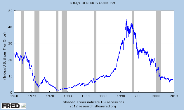
I usually caution investors from looking at these types of charts, so you’ll have to excuse me, but here’s a look at how the Dow has performed in terms of gold since 1968.
The difference is that I think this chart is interesting for its own sake. I don’t think there’s any useful analysis here. For one, it leaves out dividends which add up over the decades.
The trend of gold’s out-performance over the past several years is remarkable. If the Dow had kept pace with gold since August 25, 1999, it would be at 77,800 today instead of 13,500.
On January 21, 1980, the ratio got down to 1, but by August 1999, it had risen to 44. Since then, it’s been down, down, down. In August of last year, the ratio fell below 5.8. By this past August, the ratio got back over 8.2, and today we’re right around 7.75.
Eddy Eflenbein – Crossing Wall Street – October 16th, 2012


